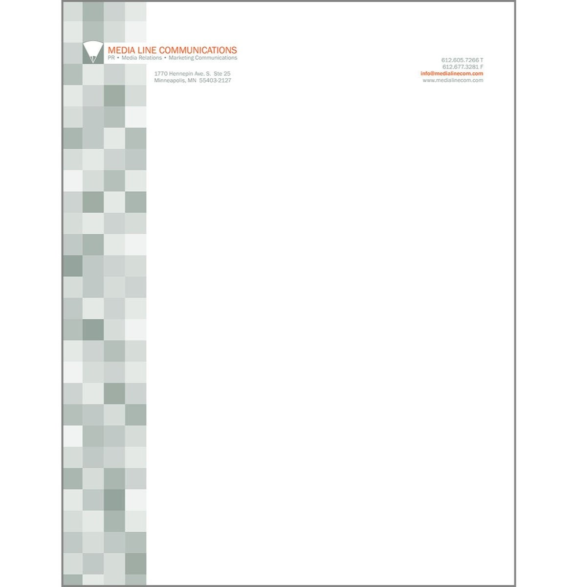
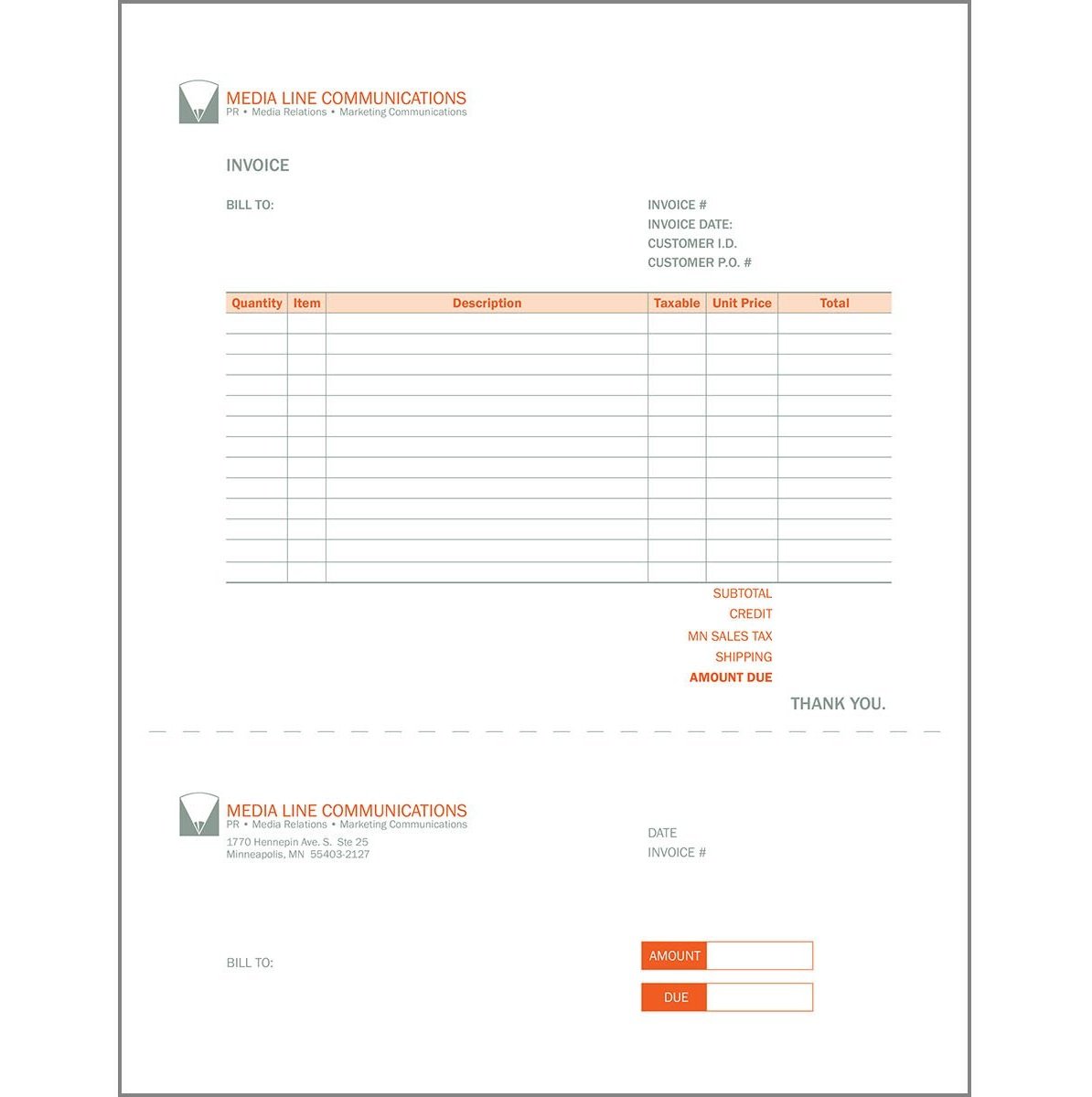
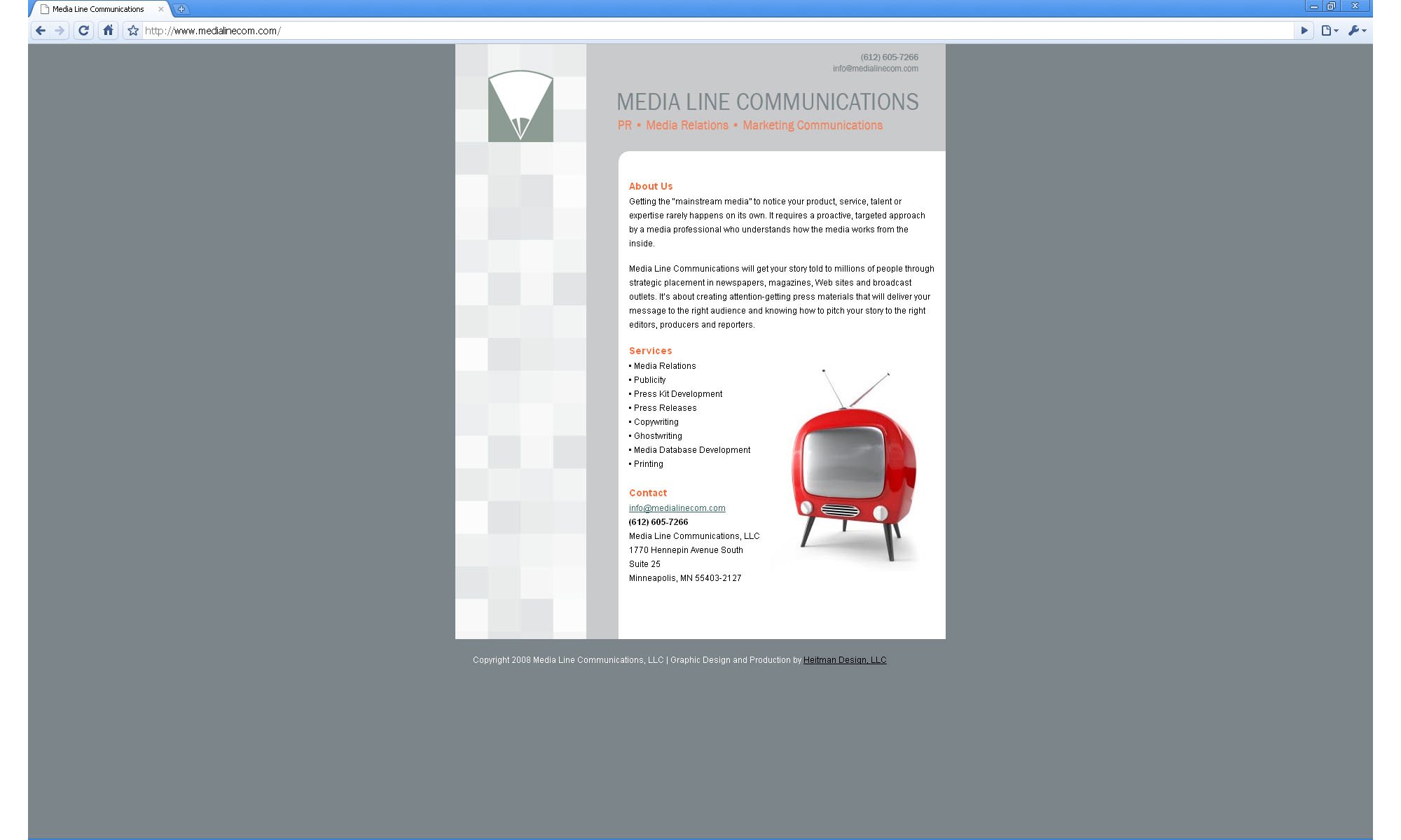
Media Line Communications, a text-savvy public relations firm wanted a logo that represented their focus on strong writing. The owner’s surname starts with the letter M. Marrying these two facets of the client’s identity resulted in a logo that forms a pencil/pen tip in the negative space of the letter form. Business cards, letterhead and other collateral as well as a web splash page completed the package.


